

How to: ID Your Artist Self (i'm starting with the dog in the mirror)
i'm asking him to change his waaaaays if he has the time and the emotional capacity to open illustrator and make a logo


*in the voice of you* “Post your work online!” “Make some TikToks!” “Have you shared that on Instagram"?” I mean… these sentiments are all easier said than done, right? Like sure, I don’t mind posting a photo dump of some selfies and the three times I went outside this month, but the people want art! And all of my friends are telling me that the best way to grow as a designer and an artist is to try and get a following on social media. But I don’t want to sandwich something that I’ve worked 12 hours on in between a mediocre plate of sushi and glam pic of my new haircut. So I need my own art account.
Well, with a new account, comes a new profile picture. And a new identity really. How is it that I’m supposed to separate myself as a human with a normal, corporate job from the true artist within me? (and yes… she’s a 50 year old eastern european from the 1930’s who wears the tiniest glasses you’ve ever seen). I guess I need a brand…
But HOW. DO. I. DO. THAT. Do I go with a classic helvetica, tight kerned wordmark? It’s too basic. Do I go with a just a solid color that no one has ever seen before… that’s right… i’m going to invent my own color for this… be for real. I don’t know where to start, and the thought of all this is giving me crushing adhd paralysis. maybe i’ll just copy gina’s balloon dog and call it a day.
*back to my voice"* let’s begin the tutorial, shall we?

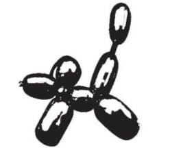
Many of you are probably curious how the balloon dog came to be and how it has evolved to serve me and my brand for the past five years. Let me tell you the quick story, as I think it’s going to be helpful in your own branding endeavors. When I was a kid, my family went out to a restaurant and there was a guy walking around making balloon animals. He kinda looked like this:

and this guy made me a powder blue balloon dog. for some reason or another, this dog had me locked IN. and I carried it with me for some time, until you know… physics or something kicked in, all the air ran out, and it was just a sad 1ft. long deflated balloon with two sharpie dots where the eyes once were. didn’t matter to me! i was an only child for 20 years and as a kid, this thing was like my BROTHER, for approximately one week. i remember vividly going to the GIANT grocery store on White St. back in my hometown and getting back in the car with my mom and noticing that i had lost my sweet, latex string bean somewhere in the aisles of the supermarket. how lonely and cold must my brother be, whilst he layeth on the bright white tiles, surrounded by grocery cart skid marks…
all of that to say, he was gone, but never forgotten. i took his memory with me for some strange reason until it was time to make an art account, and i needed a new identity. and i went through the exact same grasping process as you guys do. what if i tried this? would this work? maybe i’ll start with nothing and just figure it out on the way. i don’t know if this will ever even take off. until i thought back on my key identifying moments, and WHICH of those moments i felt could connect and pull at the strings of my artist inside. balloon dogs were fairly known, but more quirky and less mainstream than they are now, 5 years ago. and it turns out jeff koons (that guy who does the balloon dog sculptures) is from my hometown, and he’s a tooootal douché. So what better way to reclaim the iconic icon balloon dog from the jaws of toxic masculinity?
thus, SHE was born.
over the years, she has gone through changes, as we all have. an important piece of advice i had learned somewhere when it comes to branding is that businesses who never evolve their identity often appear to the public as not having done any internal reflection or review of what has made them successful and what needs to be worked on. I never wanted to fall into the trap of staying the same for same sake. Yes, my branding had become quite recognizable in the community, but I knew that this threshold stock photo balloon dog was at some point, beneath the level of skill that I wanted to present. So then, SHE was born.
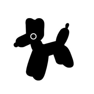
Now she is the probably the dog that most of you know me for. I was quite satisfied with the recognizability (if that’s a word) of this doggie and kept her as me for over three years. From her, I received DM after DM of people, friends, and strangers sending me images across the world of balloon dog statues, toys, etc. Very heartwarming. And made me feel like this truly was my identity. People were actually associating me in different parts of the WORLD with a balloon dog. But eventually, as in, like a few months ago… I started working a new job, and I felt that while I love the artist side of me and the work that I do, I also was discovering new skills in the professional side of graphic design, and I was/am very excited about that. I needed a revised identity that encompassed ALL of me, not just the art side of me, although that arguably is the fun part and what I want to visually display the most. So then SHE was born.

and that’s the history of my logo and its evolution. and there’s a story in there somewhere about how to brand yourself. so let me pull it out for you.

to summarize:
who is YOUR artist self: do they live in this time period? do they have male pattern baldness? do they speak 6 languages, one of which is hieroglyphics? are they ho·lis·ti·cal·ly YOU? or are they an entity? do they like bright colors or would they prefer to work in greyscale? are they interested by war history or do they prefer drama and theatre? a part of my artist self is a version of me that i didn’t get to live for one reason or another. so in that sense, it’s stuff that i as a human, really love and want to incorporate into my work, but it’s not necessarily me. because me is always changing, and i don’t have time to bust out a new logo every time i see a new season of rupaul’s drag race.
what’s YOUR story: take some time to sit down and list out, verbally, in a word doc, in your imagination, your favorite life stories. as you read in mine, it doesn't have to be the most exciting thing or character building exercise. but maybe that’s what feels most telling about yourself. maybe you almost drowned (i hope not) when you were 7 and it *changed* you for the better. you’re an artist who loves working with blues and fluid shapes. so then maybe your logo is a icon of the shape of the river where your great aunt pulled you out by a beach towel. these types of logos have meaning behind them, and i find it super rewarding to tell a life story to someone about my logo because as humans, we aren’t connecting ENOUGH!! when someone has a wordmark or a logo that’s just helvetica, what’s there to unpack? you like clean, simple design? so does everyone, get in line.
don’t be afraid to rework: i’ve heard countless times that when making a logo, it needs to be timeless. it has to last the test of time. places like supreme, nike, mcdonalds, they don’t change their logo. everyone knows what it is and everyone will know what it is forever. okay well let’s be so real, you aren’t any of those companies. and you think that any of those companies never pitched changing their logo completely? the internal stakeholders don’t want you to know that they’ve probably considered it at some point in the process. but you are your own internal stakeholder. change things up when they don’t feel right anymore. if that river went through climate change erosion and now it’s gotten more jagged edges, add the jagged edges. you aren’t bound by anything because you’re not a multi-million dollar entity. my logo now is me now. my logo now won’t be me in 10 years, and if it is, then i need to do some serious thinking on my progression as a human.
if you read this thinking, “she’s going to tell me how to design a logo,” bb i am so sorry i literally have no idea how to make a logo but i’m sure there’s a great youtube video about it! this is more to just get you thinking abstractly on your brand. :-)

listening to:
(i mean, duh… how could i not go there lol)
pinning to:
we’re in fake spring right now in maine and so like i’m ready to start my spring inspo board but also trying to be patient.
i’m reading:
(yes i’m like actually reading a book right now!! it’s about two gals who work a newsroom and they send emails back and forth and the IT guy reads them all and gets creepy)
hyperfixated on:
like truly the best show i’ve ever seen in my life
new art to share:
eek… not right now… but soon! things are in the works… as they all say… BUT i will say i just bought studio aaa’s dither boy program and it’s so easy to use and super cool. hopefully gonna have some time this weekend to mess with it more and share some stuff. not paid or sponsored at all, jack is a good friend but truly this is really dope and i know there was a lot of hard work put into this. so if you can support a pal + want a cool design program, buy it.
i love the silliness you brought into this, what a wonderful read. it got me thinking about my own logo! everyone say thank you gina!!!!!